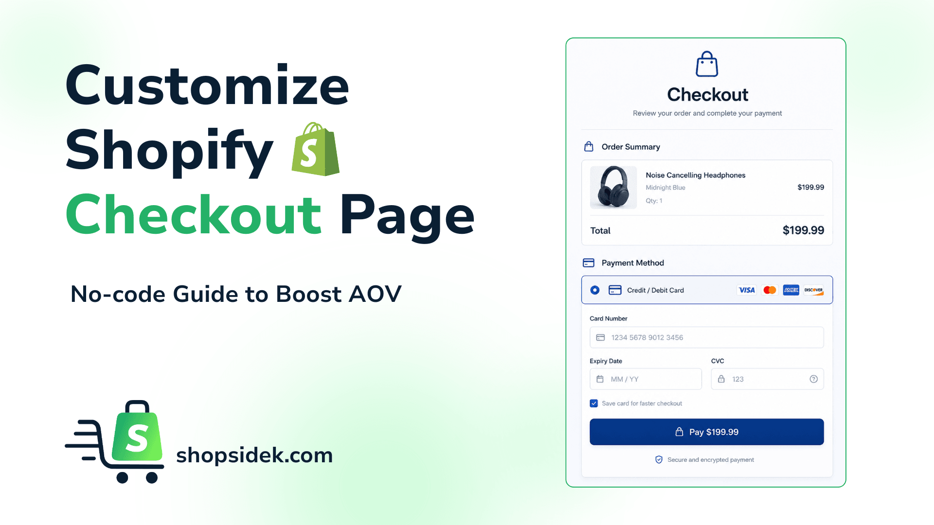
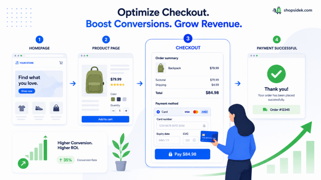
The checkout page is the ultimate moment of truth for your eCommerce store. With industry data showing that nearly 70% of shoppers abandon their carts, a generic or clunky checkout experience is one of the most significant sources of lost revenue. If your final payment screen feels disconnected from your brand, you’re giving customers a reason to second-guess their purchase at the most critical step.
This guide is your complete playbook to customize Shopify checkout page and fix that leaky bucket. We’ll focus on Shopify’s latest Checkout Extensibility framework—the modern, upgrade-safe way to create a high-converting experience without writing a single line of code. Whether you’re on a regular Shopify plan or using Shopify Plus, these actionable steps will help you build a checkout that secures sales and reflects the quality of your brand.
Why Your Checkout is the Most Important Page on Your Store
Think of your checkout as the “last mile” of the customer journey. While your homepage and product pages are designed to create desire, your checkout page is built to create trust. This is why learning how to customize Shopify checkout page is so crucial.
This is the moment a visitor transitions from a casual browser to a paying customer, ready to enter sensitive payment information. If the branding suddenly disappears or the layout feels unfamiliar, that hard-earned trust can evaporate in an instant.
From my perspective, optimizing your checkout is the highest-impact activity you can undertake to increase revenue. Unlike marketing campaigns that require continuous spending to attract new traffic, improving your checkout converts the visitors you already have. A small lift in your conversion rate here doesn’t just mean more sales; it means a higher return on investment for every ad, email, and social media post you’ve ever run.
New Checkout Rules: Regular Shopify vs. Shopify Plus
💡 Key Update for 2026: Before we start, two major changes have reshaped how checkouts work on Shopify:
- The End of checkout.liquid: Older guides might mention editing the checkout.liquid file. For all but the largest Plus merchants, this option is gone. Customizations are now done through apps and Shopify’s new “Checkout Extensibility” framework.
- The Default One-Page Checkout: Shopify has moved to a standardized one-page checkout for faster, higher-converting experiences. This guide is built specifically for this modern layout, ensuring all advice is relevant today.
Now that you understand the new framework, here’s exactly what you can control on a regular Shopify plan versus what requires an upgrade to Shopify Plus.
| Feature | Regular Shopify (Basic/Grow/Advanced) | Shopify Plus |
|---|---|---|
| Brand Logo & Colors | ✅ Yes | ✅ Yes |
| Fonts & Typography | ✅ Yes | ✅ Yes |
| Express Checkout Buttons (Shop Pay, PayPal) | ✅ Yes | ✅ Yes |
| Custom Fields (e.g., gift messages, delivery notes) | ❌ No | ✅ Yes |
| In-Checkout Upsells & Order Bumps | ❌ No | ✅ Yes |
| Editing Checkout Logic & Layout (with code) | ❌ No | ✅ Yes |
| Checkout UI Extensions (Advanced Apps) | ❌ No | ✅ Yes |
In short, regular plans are great for branding, while Shopify Plus is necessary for adding new functions or changing the structure of your checkout page using apps built on Checkout Extensibility.
If you are on a standard tier, your primary focus will be aligning the native visual elements with your store’s identity to build trust. For scaling businesses, unlocking Shopify Plus checkout customization is often a strategic priority to deploy tailored form fields, custom logic, and high-converting, in-checkout revenue drivers.
5-Step Playbook: Customize Shopify Checkout Page on Any Plan
For most Shopify merchants, a few strategic, no-code adjustments can dramatically improve the checkout experience. This five-step playbook focuses on the highest-impact changes you can make to customize Shopify checkout page directly from your Shopify admin right now, without needing to upgrade your plan.
🔖If you’re new to Shopify’s admin panel, our complete guide to using Shopify’s theme editor will help you get comfortable with the visual customization tools before diving into the checkout settings.
1. Match Your Brand Identity in the Checkout Editor
I’ve found that a consistent brand experience is the foundation of trust. When a customer clicks “checkout,” the visual style should feel like a seamless continuation of your store, not a generic payment form.
Here’s how to quickly update your checkout’s appearance natively in Shopify:
- Go to Settings > Checkout in your Shopify admin.
- In the Configurations section, click Customize next to your active checkout configuration.
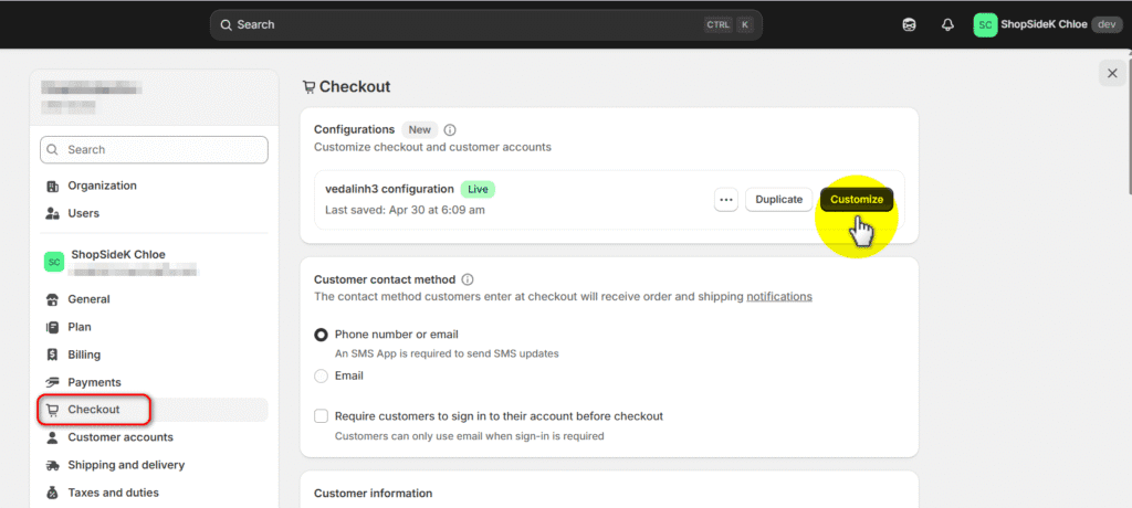
- Inside the checkout and accounts editor, click the gear icon on the left sidebar to open your Settings.
- Look for the Header & logo section and upload your logo image there. From this same menu, you can also adjust your background colors, fonts, and button colors to perfectly match your brand’s style guide.
- Click Save.
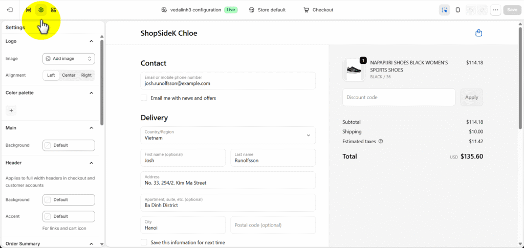
💡Pro Tip: Make sure your logo image doesn’t have extra margins or whitespace around it. Because the checkout header scales the image based on its total file dimensions, built-in whitespace will make your actual logo appear much smaller than expected.
2. The “Language Editor Hack” for Trust-Building Copy
Some of the most powerful checkout customizations are hidden in plain sight within Shopify’s language editor (now called Theme Content). By changing a few default words, you can add clarity and reinforce security at critical moments.
Instead of settling for generic button text, you can use this area to actively build trust right before the customer hands over their credit card details.
Here is how to make these high-impact copy tweaks:
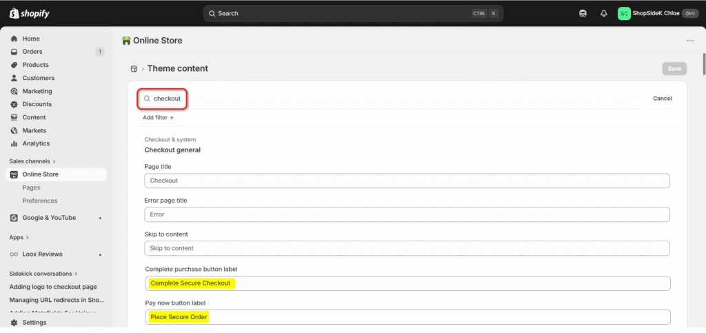
- From your Shopify admin, go to Online Store > Themes.
- Click the three dots (…) next to your active theme and select Edit default theme content.
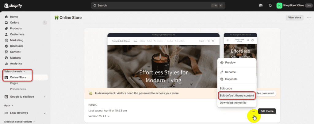
- In the search bar at the top, type “checkout” to filter the system fields.
- Scroll down to the Checkout & system / Checkout general section.
- Look for the Pay now button label or the Complete purchase button label (which usually defaults to “Pay now” or “Complete order”).
- Change this default text to something that implies safety, such as “Place Secure Order” or “Complete Secure Checkout.”
This is a tiny, two-minute change, but reassuring the customer at the exact moment they are about to finalize their purchase is a proven way to reduce last-second abandonment. You can also use this same menu to tweak the Continue button label to something more descriptive, like “Continue to Secure Shipping.”
3. Activate Express Payments & Shop Pay (and its 91% CVR Lift)
The single best way to reduce friction is to let customers skip the forms entirely. Express payment options like Shop Pay, Apple Pay, and PayPal allow returning customers to check out in a single click.
The impact of this is enormous. According to official Shopify data, merchants using Shop Pay see a 91% higher conversion rate on mobile and a 4x faster checkout experience. Enabling these options is a non-negotiable step for any serious store owner. You can activate them in the Settings > Payments section of your Shopify admin.
4. Remove Friction: Enable Guest Checkout & Simplify Forms
Forcing a new customer to create an account before they can buy is a classic conversion killer. Many shoppers are hesitant to commit to a profile upfront and will simply abandon their cart if they hit a registration wall.
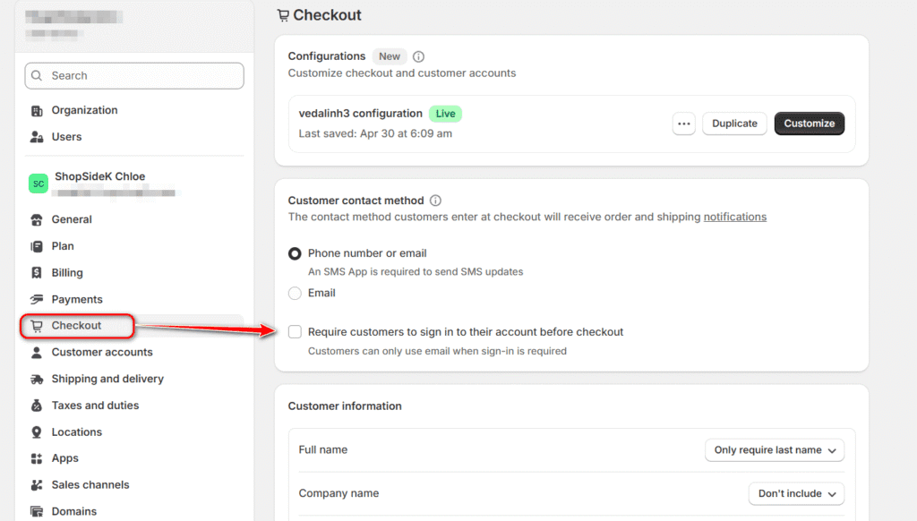
You can easily remove this friction by verifying your guest checkout settings natively:
- In your Shopify admin, go to Settings > Checkout.
- Scroll down to the Customer contact method section.
- Make sure the option to “Require customers to sign in to their account before checkout” is left unchecked.
- Click Save.
This simple toggle ensures buyers can breeze through the payment process without any roadblocks. By allowing guest checkouts, you capture the impulse buy immediately. You can always prompt them to save their information or create an account after the sale is already secured.
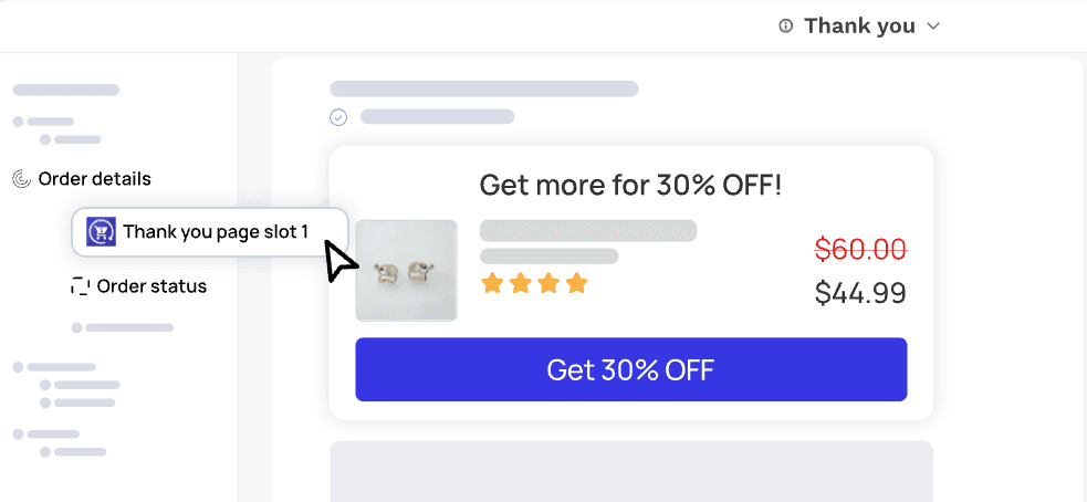
5. Customize Your Thank You and Order Status Pages
The thank you page Shopify provides is one of the most underrated assets. While its primary function is to confirm an order, its potential is much greater. In your standard Shopify settings, you can add tracking scripts like the Facebook Pixel or Google Analytics tag to this page to measure conversions accurately.
However, the real power move is to transform this page from a transactional dead-end into a revenue generator. An app like Upsell.com – ReConvert allows you to completely customize the order status page with a drag-and-drop editor. You can add post-purchase upsells, collect customer birthdays for future marketing, display a survey, or offer a limited-time discount to encourage a second purchase. This strategy captures customers when their buying intent is at its absolute peak.
Unlocking Advanced Customization with Shopify Plus
When your business needs to move beyond basic branding and start adding custom functionality to the checkout process itself, it’s time to explore Shopify Plus. Upgrading unlocks Checkout Extensibility, a powerful and secure framework that allows approved apps to add new features directly into your checkout flow.
This capability transforms your checkout from a simple payment page into a dynamic, interactive tool for gathering crucial information and increasing order value. Let’s explore two distinct ways this works in practice.
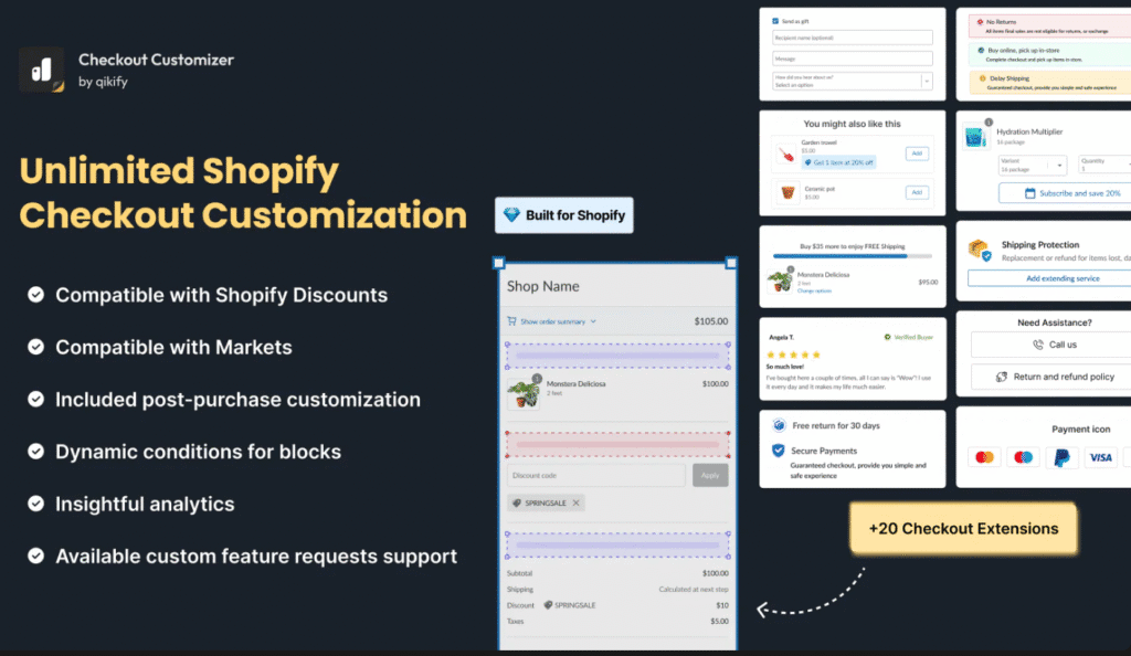
Adding Custom Fields, Banners & Trust Signals
For many businesses, the standard checkout form is missing crucial fields needed for fulfillment or marketing. For example, furniture retailer enGold needed a way to ask customers for specific delivery details. Their checkout includes a custom field asking about potential obstacles like “any stairs, steps, or access restrictions“ to ensure their delivery team can perform the service safely and efficiently.
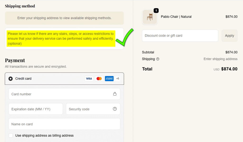
On a standard Shopify plan, collecting this critical logistical information is impossible. With Shopify Plus, this becomes straightforward. Using an extensibility app like Qikify Checkout Customizer, merchants can precisely edit the checkout UI. This allows you to:
- Add custom fields to collect gift messages, delivery instructions, or survey data.
- Display branded banners with important shipping information or brand values.
- Embed trust badges right next to the payment section to reduce anxiety.
The goal here is to remove friction and answer last-minute questions, ensuring you have all the information needed to provide an excellent customer experience.
Driving AOV with In-Checkout Upsells & Offers
Beyond improving the form, the true power of Shopify Plus is its ability to generate new revenue during the checkout. While standard plans can offer upsells after a purchase, Plus allows you to present offers directly within the payment page when buying intent is at its peak.
The same powerful app, Qikify Checkout Customizer, excels at this by allowing you to add strategic sales-drivers like:
- Product Recommendations: A “You might also like” section that suggests relevant, low-cost add-ons.
- Reward Progress Bars: Visually encourage customers to add more to their cart with messages like, “You’re only $10 away from free shipping!”
- Discount Listings: Automatically show customers all available discount codes they’re eligible for, prompting them to increase their order value to meet a minimum spend.
These features capture impulse buys frictionlessly, turning your checkout page into an active tool for boosting your AOV. For merchants looking to implement bundling strategies before the checkout stage, our guide to the best product bundling apps covers tools that work across your entire store.
3 Hacks to Improve UX Before They Reach the Checkout
A high-converting checkout experience begins long before the customer sees the payment form. By optimizing the journey from the product page to the cart, you can build momentum and reduce the friction that causes shoppers to abandon their purchase. Here are three powerful hacks to improve the user experience before the final click.
Hack #1: Use Dynamic Checkout Buttons
For single-product purchases, the traditional “Add to Cart” button can be an unnecessary step. Many modern Shopify themes include Dynamic Checkout Buttons, often labeled “Buy it now.” These buttons skip the cart page entirely and take the customer directly to the checkout, pre-filled with their chosen product. This is perfect for impulse buys and streamlined shopping, reducing the number of clicks required to complete a purchase.
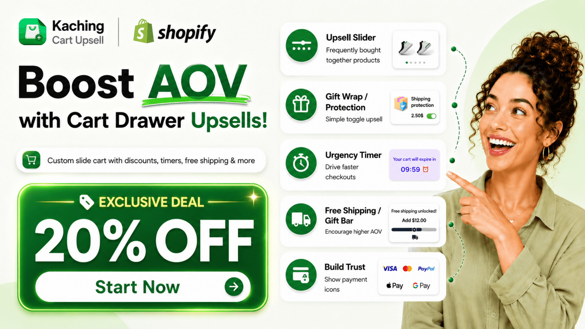
Hack #2: Optimize the Cart Drawer
Sending customers to a separate, clunky cart page can break their shopping flow. A far better approach is to use a sleek, slide-out cart. An app like Kaching Cart Upsell replaces the traditional cart page with an interactive overlay that keeps the customer engaged. You can enhance this drawer with a free shipping progress bar, in-cart upsells, and trust badges, ensuring the user is fully motivated and informed before they commit to the checkout process.
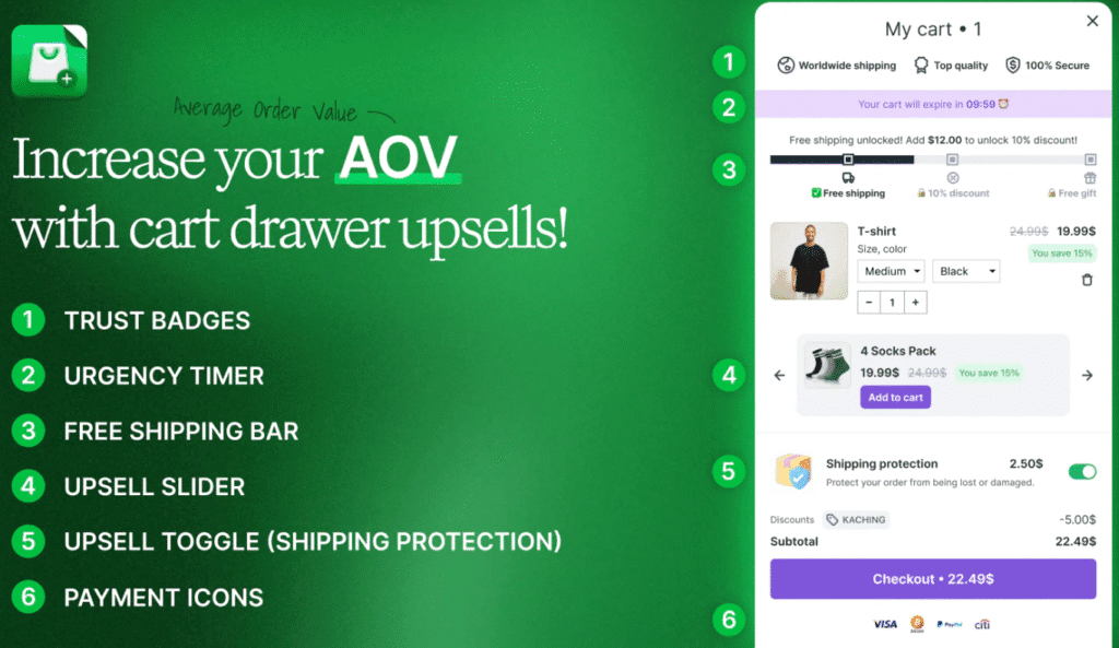
🎁 ShopSideK Exclusive Deal: 20% OFF with discount code.
Hack #3: Add a Shipping Calculator
Unexpected shipping costs are the number one reason for cart abandonment. The best way to combat this is with transparency. By adding a shipping calculator to your product pages or within the cart drawer, you allow customers to see their estimated costs upfront. This eliminates surprises on the final payment screen, builds trust, and ensures that the shoppers who proceed to checkout are highly qualified and ready to buy.
3 Real-World Examples of High-Converting Shopify Checkout Page Customization
Theory is helpful, but seeing these principles on successful Shopify stores is even better. Let’s break down how three different brands customize their Shopify checkout page to solve specific business challenges and enhance the customer experience.
1. Taylor Stitch: Combining Speed with Risk Reversal
Menswear brand Taylor Stitch excels by focusing on clarity, speed, and eliminating buyer anxiety. By adopting the modern one-page checkout, they have created a clean, uncluttered path to purchase that immediately puts the customer at ease.
Key Features: At the very top, they prominently display Express Checkout options (Shop, PayPal, Google Pay) to fast-track returning users. More importantly, they utilize a custom block in the order summary to highlight their “Long Haul Guarantee.”
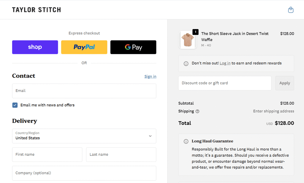
Why It Works: Placing express payments at the top removes friction instantly. Meanwhile, the “Long Haul Guarantee” text—promising free repairs or replacements—acts as the ultimate trust signal. By placing this risk-reversing message directly below the final price, Taylor Stitch effectively neutralizes last-minute purchase hesitation.
2. Tentree: Weaving Brand Values into High-Converting Upsells
Tentree’s mission—to plant ten trees for every item purchased—is central to its brand. Instead of just relying on static logos or text, they use the checkout space to actively engage customers in their mission while simultaneously driving up AOV.
Key Features: Tentree utilizes custom checkout blocks to present brilliant, mission-aligned order bumps. On the left, they offer a combined “Protect Your Order + Plant 1 Tree” package. On the right, directly under the order total, they feature a “Sequester Your Carbon Emissions” section where customers can add extra trees to their cart with a single click. They also include a custom yellow warning banner to proactively address international duties and PO box restrictions.
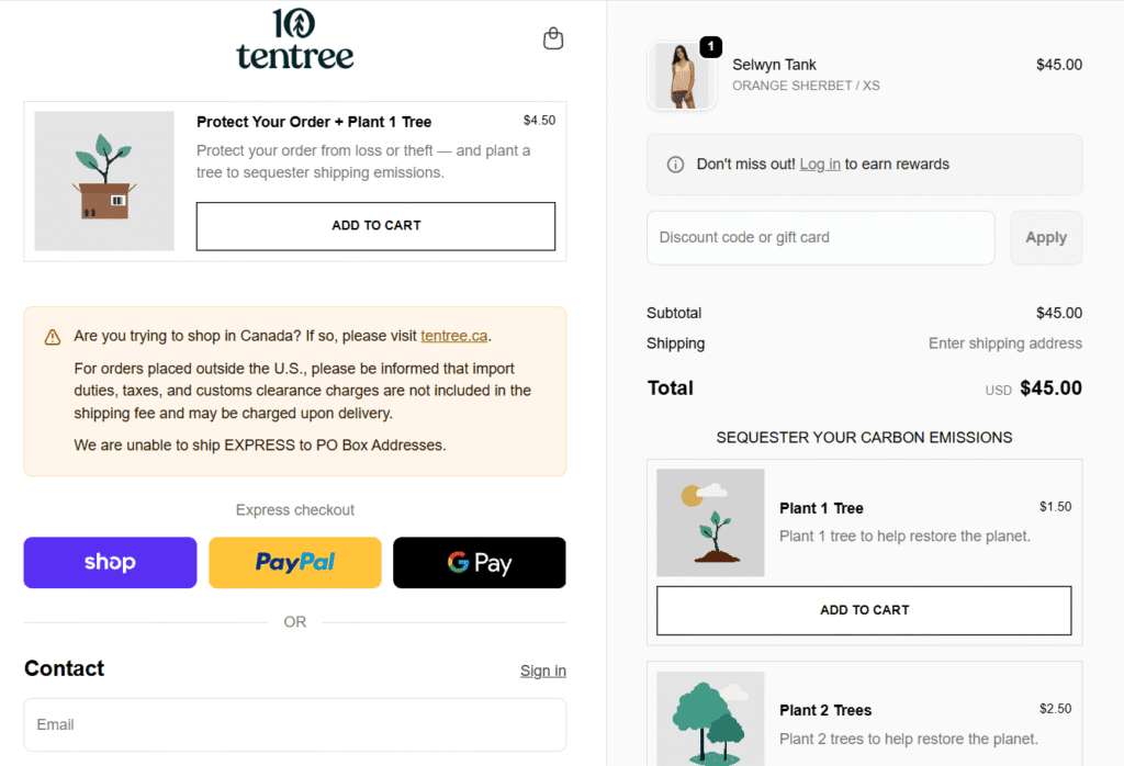
Why It Works: This is a masterclass in utilizing Shopify Plus checkout extensibility. By bundling a standard eCommerce upsell (shipping protection) with their core brand identity (planting trees), the offer feels authentic and purpose-driven rather than purely transactional. Furthermore, the custom shipping disclaimer reduces friction, prevents post-purchase frustration, and lowers customer support tickets.
3. Allbirds: Driving AOV and Real-Time Support
Sustainable footwear and apparel brand Allbirds utilizes a highly optimized checkout layout that simultaneously focuses on increasing order value and reducing last-minute buyer hesitation.
Key Features: In the order summary section, Allbirds embeds a custom “You might also like” block. This section offers highly relevant, heavily discounted accessories (like a recycled belt bag or shoe bag) with a frictionless, one-click “Add” button. Additionally, they maintain a persistent “Chat” widget in the bottom right corner of the screen throughout the payment process.
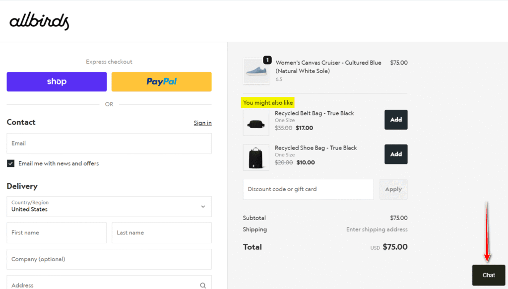
Why It Works: This setup is a perfect example of maximizing the final touchpoint. The in-checkout cross-sells act as the digital equivalent of candy at the grocery store register, capturing impulse buys and boosting AOV without disrupting the main transaction. Meanwhile, the live chat acts as a critical safety net. If a customer suddenly doubts a shoe size or shipping policy, they can get immediate help without ever leaving the checkout page, effectively saving sales that would otherwise be lost to abandonment.
Inspired by what brands like Tentree and Allbirds are doing? You can implement these same conversion-boosting tactics. Claim your Shopify 90-day free trial and see how they work on your store.
Unbiased Review: Top 4 Apps for the Ultimate Checkout Funnel
Choosing the right app depends entirely on which part of the checkout funnel you want to optimize. Instead of a simple list, here’s a breakdown of the top tools categorized by the specific job they perform, from enhancing the checkout page itself to maximizing post-purchase revenue.
1. Qikify Checkout Customizer (Best for Total In-Checkout Control)
If you’re a Shopify Plus merchant looking for a single “Swiss Army knife” to modify the checkout page, Qikify is a leading choice. It leverages Shopify’s safe Extensibility framework to add powerful conversion and branding elements directly into the payment flow.
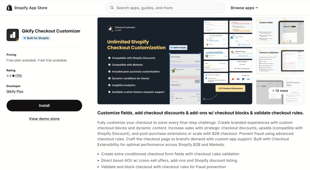
What it does: It handles both UI enhancements and revenue drivers. You can add custom fields (for gift messages/delivery notes), banners, and trust badges. At the same time, you can drive AOV with in-checkout product upsells, reward progress bars (“You’re $10 from free shipping!”), and dynamic discount listings.
Best for: Shopify Plus merchants who want one comprehensive tool to fully customize the checkout’s appearance, functionality, and profitability.
2. Kaching Post Purchase Upsell (Best for Immediate AOV Lift)
Kaching focuses on the single most profitable moment in the customer journey: the split second after they’ve clicked “Pay now.” Crucially, its core post-purchase functionality works on all Shopify plans, not just Plus.
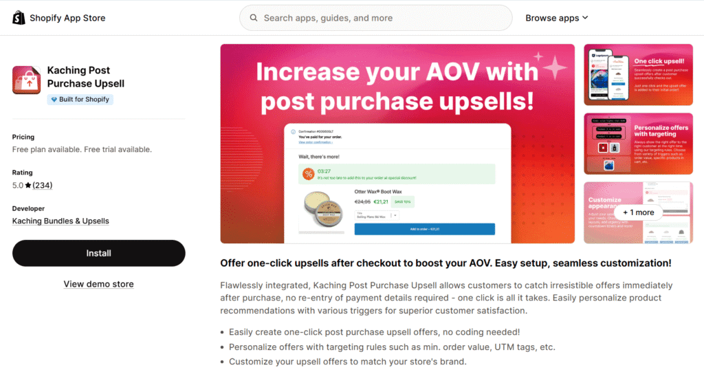
🎁 ShopSideK Exclusive Deal: 20% OFF with discount code.
What it does: It seamlessly injects one-click offers after the initial purchase is complete but before the thank you page loads. Customers can accept highly relevant upsells with a single click, instantly adding the item to their existing order without re-entering payment details.
Best for: Any Shopify merchant looking for the highest-converting, most frictionless way to increase Average Order Value immediately after the initial sale is secured.
🔖For a comprehensive breakdown of all the top tools in this category, see our guide to the best upsell apps for Shopify.
3. Upsell.com – ReConvert (Best for The Thank You Page)
Available for all Shopify plans, ReConvert transforms your static order confirmation page into a dynamic sales and marketing tool. It’s the perfect way to engage customers when their buying intent is at its highest.
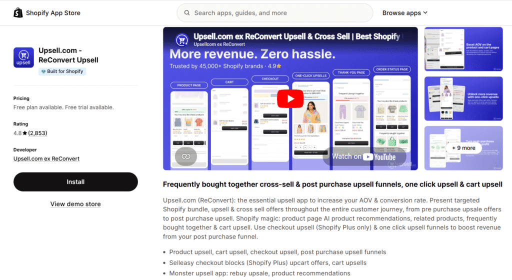
What it does: Uses a drag-and-drop builder to add post-purchase upsells, customer surveys, birthday collectors, and time-sensitive discounts directly to the thank you page.
Best for: Any Shopify merchant who wants to generate repeat business, gather valuable customer data, and capture extra revenue after the sale is already secured.
4. Releasit COD Form & Upsells (Best for Frictionless/COD Markets)
This app is a unique checkout hack that can supercharge conversions for specific business models. Instead of customizing Shopify’s checkout, Releasit allows you to bypass it entirely with a simple, high-converting order form.
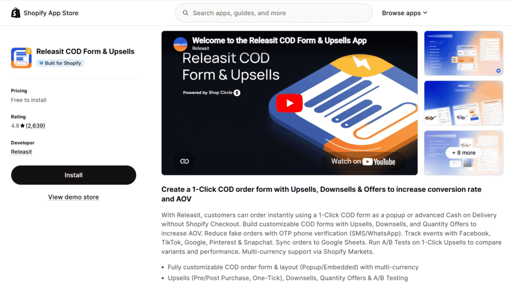
What it does: Creates a customizable 1-click order form that can be embedded on product pages. It’s ideal for Cash on Delivery (COD) markets, lead generation, or selling single products where a full checkout process is overkill.
Best for: Merchants in regions where COD is popular or those running campaigns that would benefit from a fast, form-based checkout to reduce friction as much as possible.
My Expert Playbook: 3 Checkout Rules I Swear By
After years of building, auditing, and optimizing Shopify stores, I’ve seen firsthand what actually moves the needle—and what’s just noise. When clients ask me for the absolute fastest way to increase their conversion rates, I always bring it back to these three non-negotiable rules:
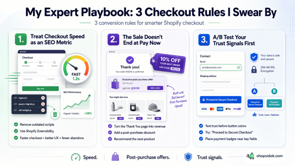
💡Tip 1: Treat Checkout Speed as an SEO Metric
Many merchants think optimization stops at the product page. I strongly disagree. The performance of your checkout heavily impacts your site’s overall user experience and your Core Web Vitals. If your checkout is bogged down by outdated, unverified scripts, it frustrates users, spikes your cart abandonment rate, and sends negative engagement signals to search engines. Keep it lean and rely on Shopify’s modern Extensibility framework to maintain blazing-fast load times.
🔖Pairing a clean checkout with one of the best Shopify SEO apps will ensure your site’s technical foundation supports both your checkout performance and your overall search visibility.
💡Tip 2: The Sale Doesn’t End at the “Pay Now” Button
The biggest missed opportunity I see is treating the Thank You page like a simple digital receipt. I always advise treating this page as the beginning of the next sales cycle. By leveraging a tool like ReConvert, you capture the customer’s attention when their dopamine levels—and brand trust—are at their absolute highest. Injecting a simple post-purchase discount or product recommendation here is the easiest revenue you will ever make.
💡Tip 3: A/B Test Your Trust Signals First
If you are only going to split-test one element on your checkout page, don’t waste time debating button colors. Test your trust signals. Try swapping out generic text like “Continue to payment” with “Proceed to Secure Checkout,” or test the placement of trusted payment logos right next to the email field. Increasing the perceived security of your checkout almost always outperforms a purely aesthetic design tweak.
Conclusion: Your Next Steps to a Higher-Converting Store
Optimizing your checkout page is not just a “nice-to-have” feature—it is a critical business function for preventing revenue loss. Every piece of friction, moment of doubt, or lack of brand consistency at this final step contributes to the massive number of abandoned carts every year. By implementing the modern, no-code strategies in this guide, you can build a seamless path from cart to confirmation that honors the trust your customers place in you.
Here is your immediate action plan to get started:
Your Immediate To-Do List:
👉 If you have a store: Go to your admin right now. Apply the “Language Editor Hack” to improve your button copy and ensure Shop Pay is enabled to offer a one-click checkout experience.
👉 If you’re starting out: Use these tactics as your Day 1 setup. Follow our complete Shopify business launch playbook to build a high-converting store from the very beginning. It gives you a significant advantage and setting you up for long-term success.
A perfect checkout page acts as your automated sales rep. Stop leaving money on the table. Start your Shopify journey for just $1/month and turn more carts into customers.
Friendly Disclosure: As a Shopify Media Partner, I may receive a small commission if you sign up using my link. It doesn’t affect your price and supports the work I do here.
Customize Shopify Checkout Page FAQs
Can I add a custom field to my Shopify checkout without Plus?
No, you cannot add custom fields—like gift messages, delivery instructions, or surveys—directly into the checkout flow on a standard Shopify plan. Shopify locks the actual checkout UI to ensure security and speed. However, a highly effective workaround is to collect this information on the cart page or within a slide-out cart drawer before the customer clicks “checkout.” To modify the checkout screen itself, you must upgrade to Shopify Plus.
How do I edit the text on the “Pay Now” button?
You can change this easily without writing any code by using Shopify’s language settings. From your admin, navigate to Online Store > Themes, click the three dots next to your active theme, and select Edit default theme content. Search for “Pay now” in the filter bar, locate the “Complete purchase button label” under the Checkout & system settings, and type in your new, trust-building copy like “Place Secure Order.”
What are Shopify Checkout Blocks?
Shopify Checkout Blocks are the foundational, drag-and-drop UI components used within the new Checkout Extensibility framework. Instead of hiring a developer to write custom code, Shopify Plus merchants and app developers can use these standardized blocks—such as banners, text fields, product recommendations, or loyalty program widgets—to safely and seamlessly build a custom checkout experience that won’t break during platform updates.